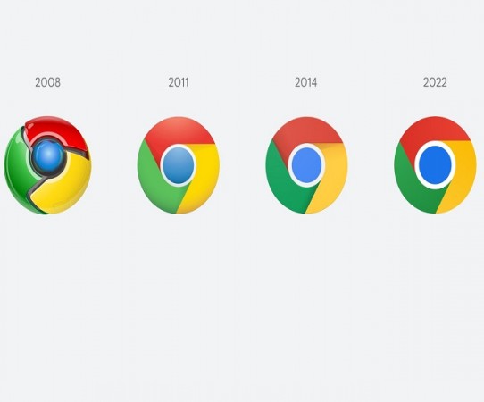
If you are using Google Chrome, then know that the design of Google Chrome has been changed once again. The new logo of Google Chrome has been introduced. However, there will be no more changes in the logo. If you look carefully, you will find that more bright colors have also been used in the new logo. At the same time, the blue circle of google chrome's new logo is much larger. Along with which, no shadow is going to be seen in the new logo of Google Chrome.
Google Chrome design changed after 8 years: The logo of Google Chrome has been changed after 8 years. According to reports, Google Chrome was launched in the year 2008. Since then, the design of Google Chrome has changed several times. Earlier, in the year 2011 and 2014, the design of the Google Chrome logo has been changed. Chrome designer Elvin Hu has also mentioned new changes in detail. Many tweets from his side have been told about the change in the design of Google Chrome.
According to Elvin Hu, the new icon of Google Chrome is soon starting to roll out on all devices. He said that the company has made the new logo quite simple. The shadow has been removed in it. Also, bright colors have been used more. This modern brand has been introduced with expression. The company has made some changes to Google Chrome for OS-specific customized windows, for Mac and iOS devices, while making another change. Windows 10, 11 have to be changed in the task bar of the Chrome icon. Also, the macOS icon has been introduced 3D icon towards Apple System App.
Airtel is going to make big investments for other businesses with subsidiaries
Adani Group incorporates new subsidiary to set up data centre in Mumbai